作者 | 弗拉德
来源 | 弗拉德(公众号:fulade_me)
BottomNavigationBar
BottomNavigationBar 和 BottomNavigationBarItem 配合来共同展示Flutter里面的底部状态栏,底部状态栏是在移动端很重要的控件。
先看一下 BottomNavigationBar构造方法
1
2
3
4
5
6
7
8
9
10
11
12
13
14
15
16
17
18
19
20
21
22
23
24
25
26
27
28
29
30
31
32
33
34
35
36
37
38
39
40
41
42
43
|
BottomNavigationBar({
Key key,
@required this.items,
this.onTap,
this.currentIndex = 0,
this.elevation,
this.type,
Color fixedColor,
this.backgroundColor,
this.iconSize = 24.0,
Color selectedItemColor,
this.unselectedItemColor,
this.selectedIconTheme,
this.unselectedIconTheme,
this.selectedFontSize = 14.0,
this.unselectedFontSize = 12.0,
this.selectedLabelStyle,
this.unselectedLabelStyle,
this.showSelectedLabels = true,
this.showUnselectedLabels,
this.mouseCursor,
})
|
我们来做一个点击底部状态栏按钮切换颜色的Demo
1
2
3
4
5
6
7
8
9
10
11
12
13
14
15
16
17
18
19
20
21
22
23
24
25
26
27
28
29
30
31
32
33
34
35
36
37
38
39
40
41
42
43
44
45
46
47
48
49
50
51
52
53
54
55
56
57
| class _BottomNavigationBarDemoPageState
extends State<BottomNavigationBarDemoPage> {
int selectedIndex = 0;
List<Container> containerList = [
Container(
color: Colors.red,
),
Container(
color: Colors.blue,
),
Container(
color: Colors.yellow,
),
Container(
color: Colors.green,
)
];
@override
Widget build(BuildContext context) {
return Scaffold(
appBar: AppBar(
centerTitle: true,
title: Text("BottomNavigationBarDemo"),
backgroundColor: Colors.blue,
),
body: containerList[selectedIndex],
bottomNavigationBar: BottomNavigationBar(
type: BottomNavigationBarType.fixed,
currentIndex: selectedIndex,
onTap: (index) {
setState(() {
selectedIndex = index;
});
},
items: <BottomNavigationBarItem>[
BottomNavigationBarItem(
title: Text('F1'),
icon: Icon(Icons.home),
),
BottomNavigationBarItem(
title: Text('F2'),
icon: Icon(Icons.book),
),
BottomNavigationBarItem(
title: Text('F3'),
icon: Icon(Icons.school),
),
BottomNavigationBarItem(
title: Text('F4'),
icon: Icon(Icons.perm_identity),
),
],
),
);
}
}
|
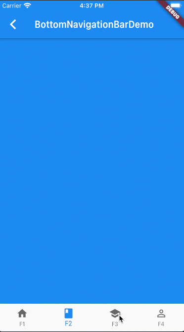
Scaffold接收一个BottomNavigationBar作为bottomNavigationBar的参数,然后BottomNavigationBar接收一个items的数组,这个数组里面传入了4个BottomNavigationBarItem对象分别命名为F1、F2、F3、F4
type参数传入的是BottomNavigationBarType.fixed,默认是BottomNavigationBarType.shifting,默认的效果是 只有在选中BottomNavigationBarItem时才会显示文字。设置成BottomNavigationBarType.fixed非选中状态下也会显示文字和图标
onTap实现的是一个方法,参数是被点击的当前BottomNavigationBarItem的下标,在这里被点击后调用setState来刷新页面的颜色
效果如下:
日常开发中以上效果基本能满足大多数需求
如果想要自定义下面Icon的样式,可以使用 BottomAppBar
这里也介绍两个不错的库
想体验以上的示例的运行效果,可以到我的Github仓库项目flutter_app->lib->routes->bottom_navigation_page.dart查看,并且可以下载下来运行并体验。
